After a year of growth in retail, canned iced tea maker Halfday is unveiling a packaging update that speaks to its maturation from next next-generation startup into a growing insurgent brand.
After a year of growth in retail, canned iced tea maker Halfday is unveiling a packaging update that speaks to its maturation from next next-generation startup into a growing insurgent brand.
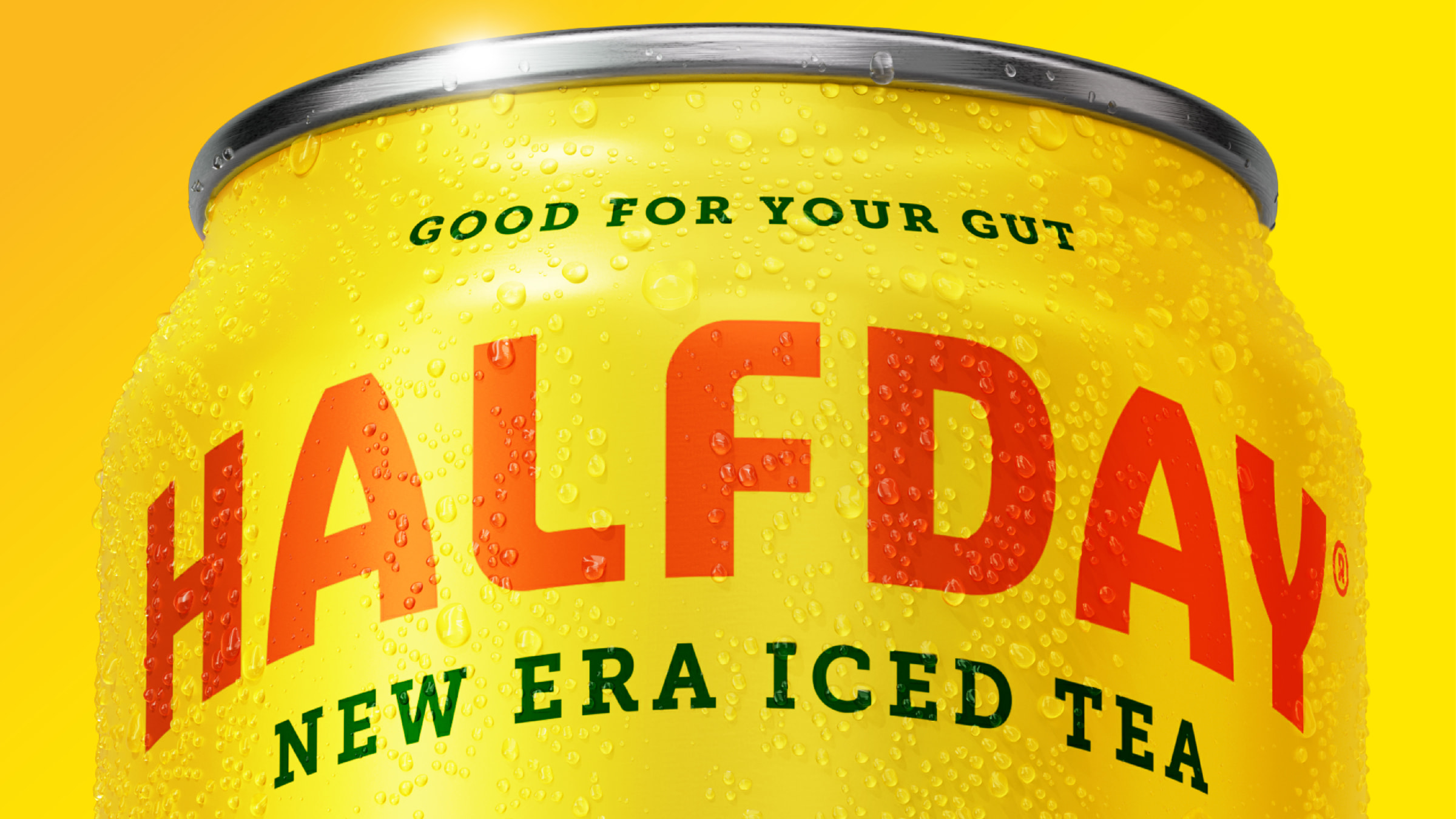
US brand Halfday’s ambition is to become the definitive premium ‘prebiotic’ iced tea, and they commissioned London-based Earthling to create a new identity to drive its expansion plans.

New Logo, Identity, and Packaging for Halfday by Earthling Studio.
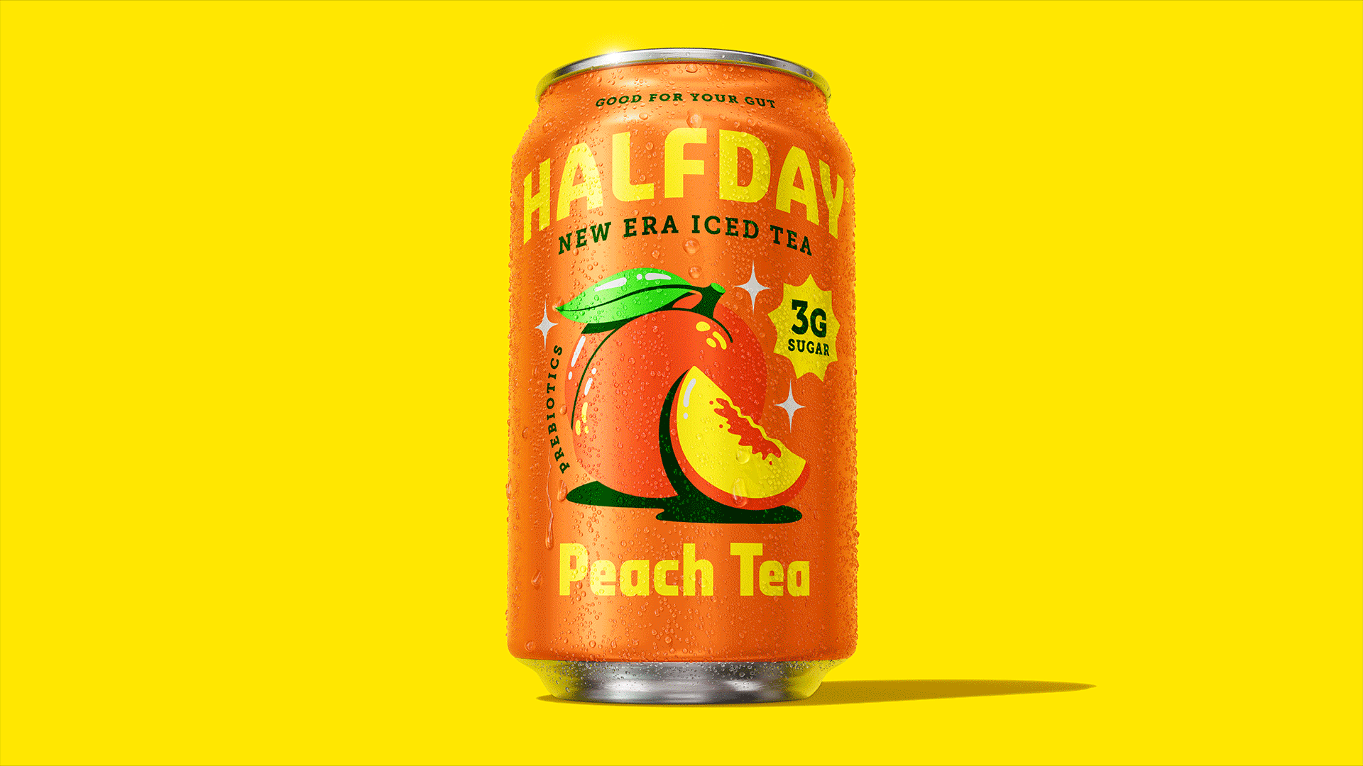
The new design cleaned up the aesthetics and is easy to navigate, effortlessly cool, and something consumers will be proud to include as part of their repertoire.
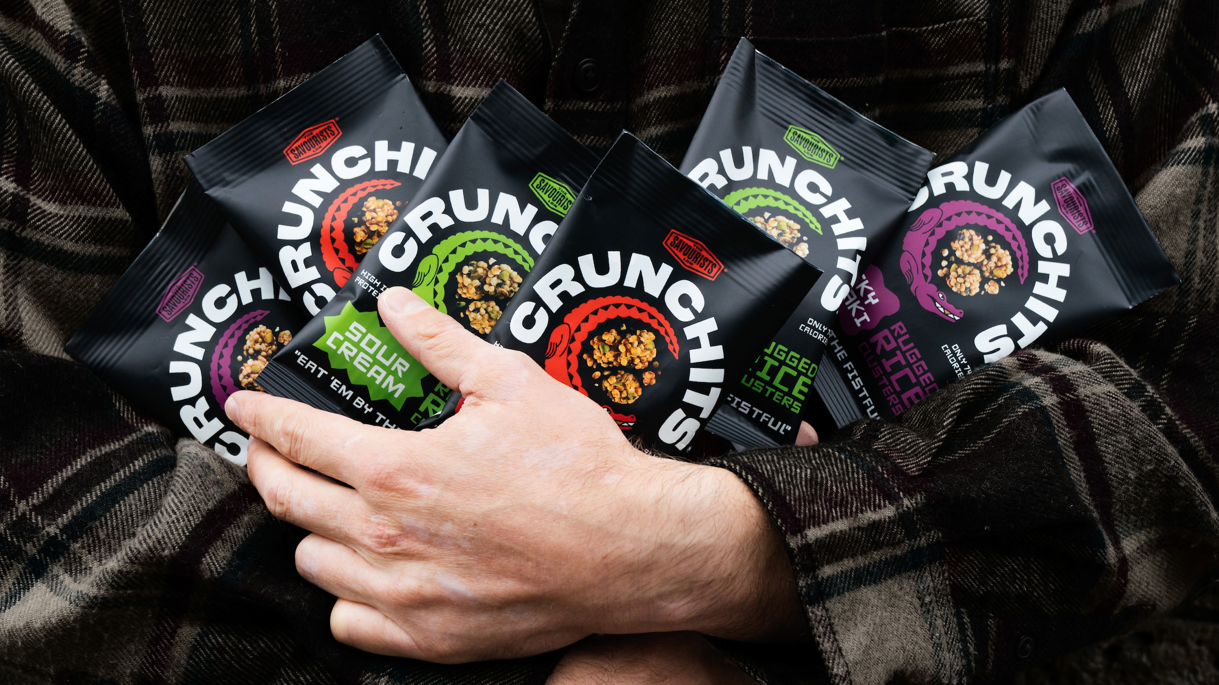
Earthling Studio Chomps Away At Typical Better-For-You Branding With Crunchits Refresh.
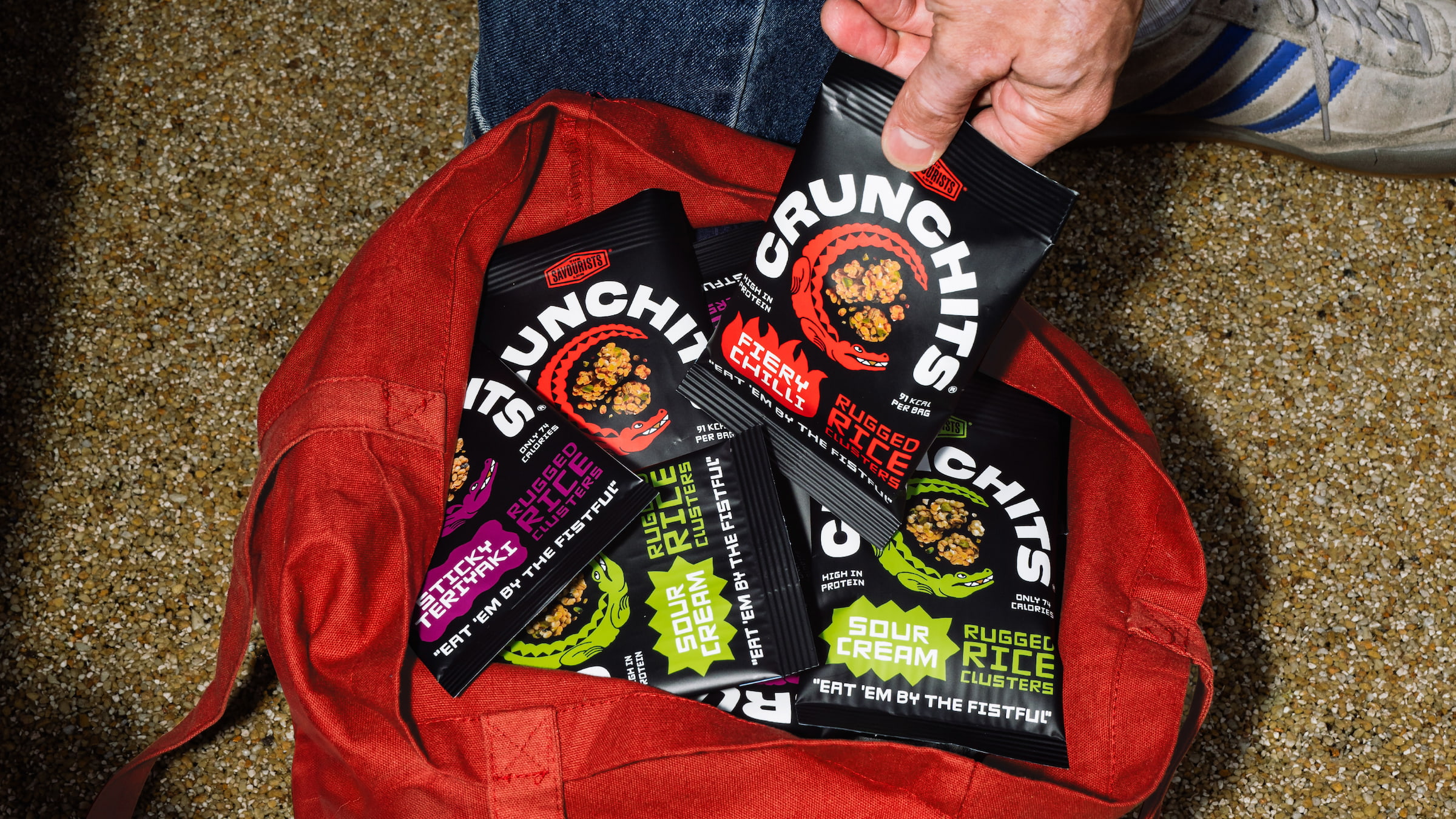
Designers are borrowing visual language associated with traditional crisps and snacks to punch up the new healthy brands.
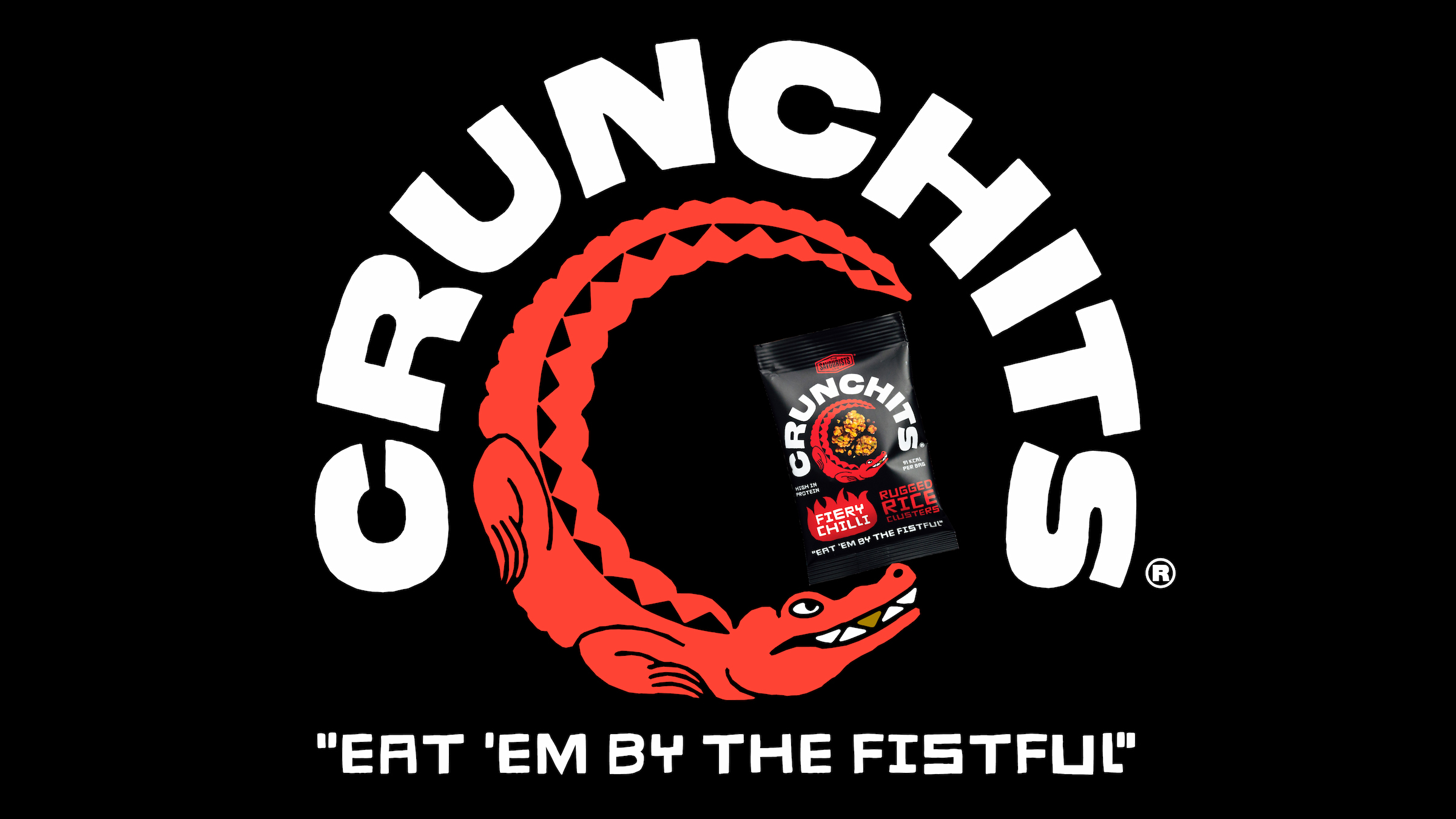
The new packaging is perfectly balanced now, with the product brand taking center stage and showcasing a photo of it right in the middle of the logo, which is such a great detail and such a great activation of the logo and its integration unto the bag.
The identity introduces some pretty cool elements, starting with the curvy, flow-y gradients with light traveling along their contours — put that on an IMAX screen and you can hypnotize a whole army.
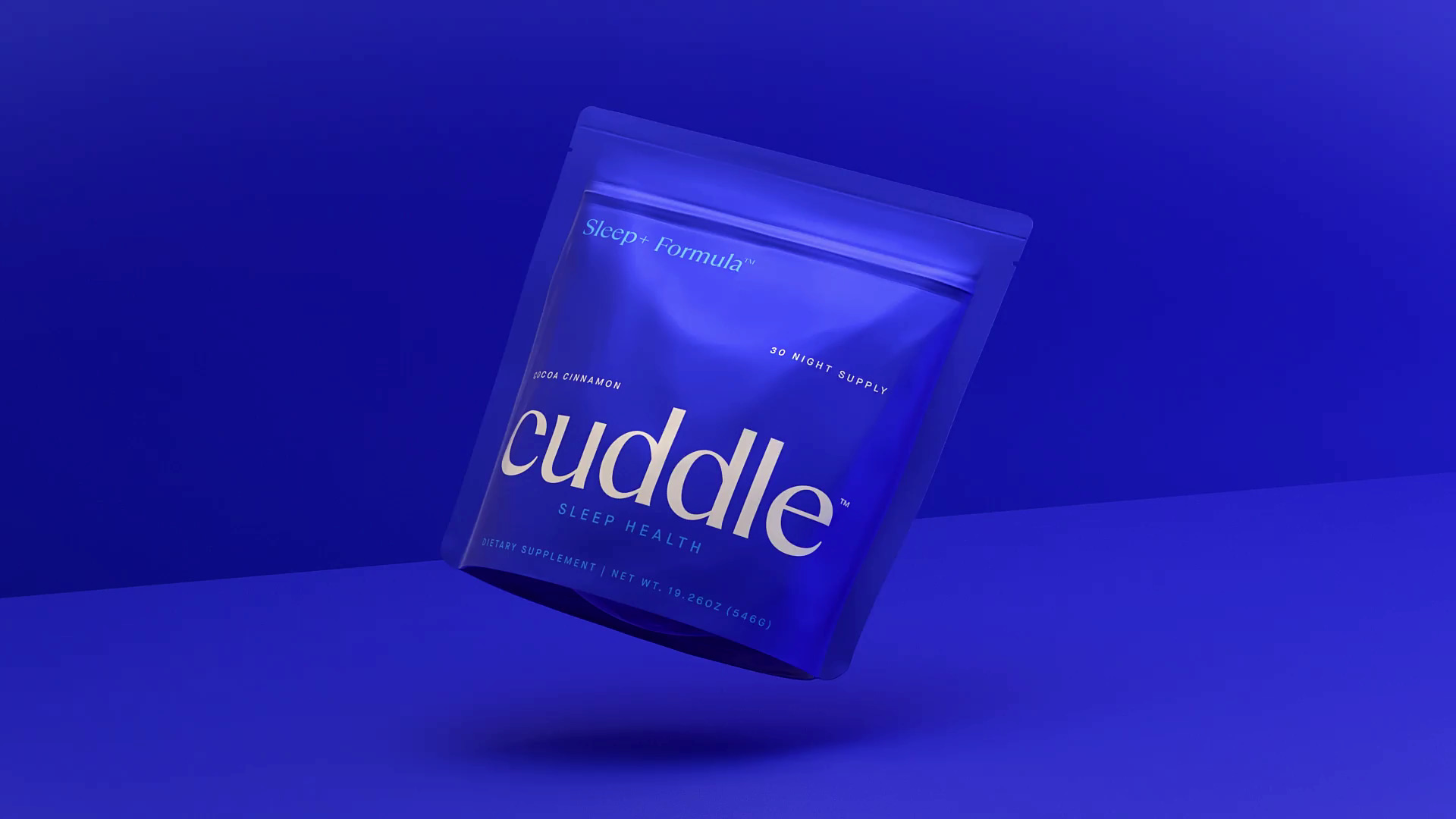
Earthling Studio builds a new entrant into the sleep supplement category – Cuddle Sleep Health – with the brief covering brand positioning, visual and verbal identity.
The new identity is all about the pop: bold, vibrant green and blue; typography that’s so full of life it looks like it’s about to jump off the sticker/box/website and dance a little jig with you, just for the hell of it.
Overall, this looks like fruit tastes: sweet, tangy, juicy, joyful.

Earthling Studio delivers a rebrand for Jaffa, the UK’s leading citrus brand focusing on freshness, quality and natural goodness, all while honoring the brands rich heritage.

Jubel has rebranded to dial up its “cut through” asset, while aiming to create a brand palette focused on delivering “flexible” consistency.

Some aesthetics never get old, and Studio Earthling’s redesign for the appetizingly peachy Jubel Beer fits in that category.
Earthling Studio enhances Jubel’s ‘dangerously refreshing’ proposition. The peach beer brand’s refreshed identity plays on codes of hazard and warning signs that seek to subvert the language of danger.

Challenger beer brand Jubel rolls out ‘dialled up’ refresh.
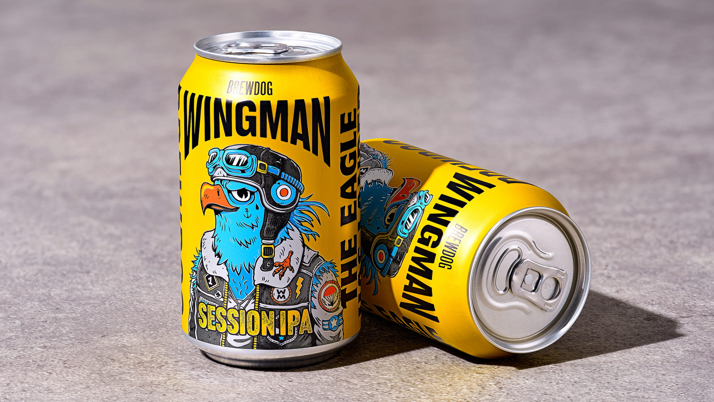
Earthling Studio recently designed the packaging for Brewdog’s new IPA, WINGMAN, in response to the identified growth opportunity in the lower-ABV IPA category.
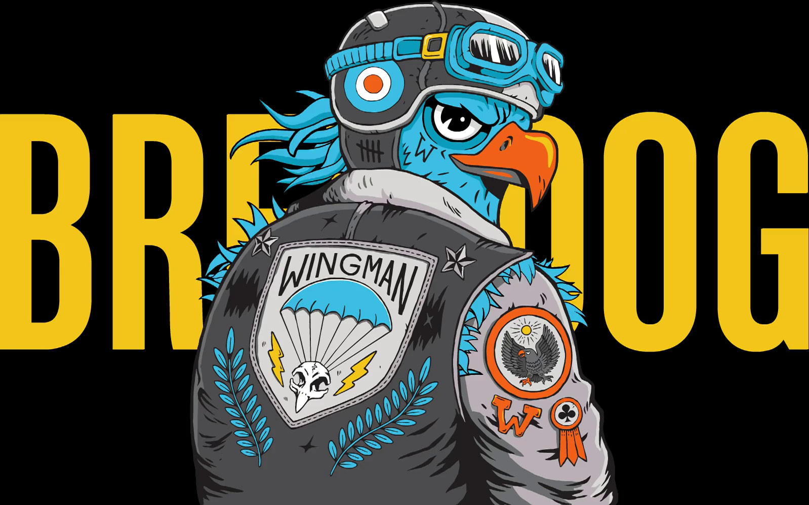
Earthling Studio flies into new territory for Brewdog sub-brand Wingman.
The Rise of Jacksepticeye: How One Of The World’s Richest YouTubers Became a Coffee Founder.
Proving a hit with fans, Top of the Mornin’ underwent a rebrand as it moved from an experiment to a full-time business enterprise.
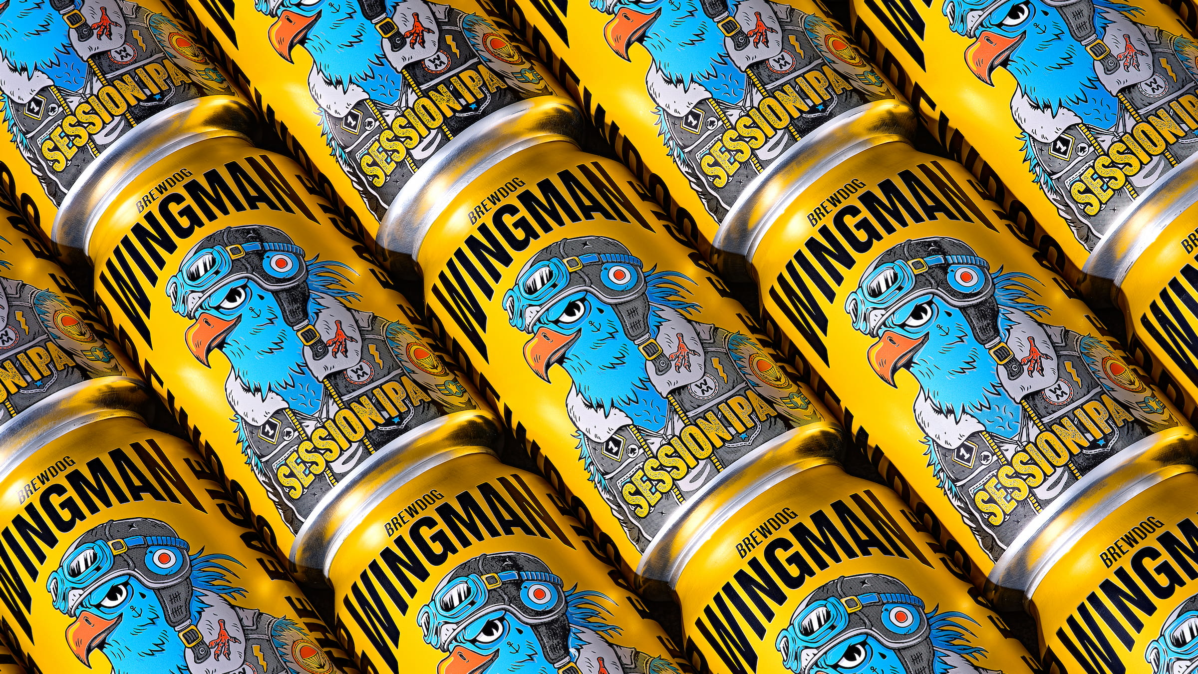
Today on Brand New: New Logo and Identity for WINGMAN by Earthling Studio.
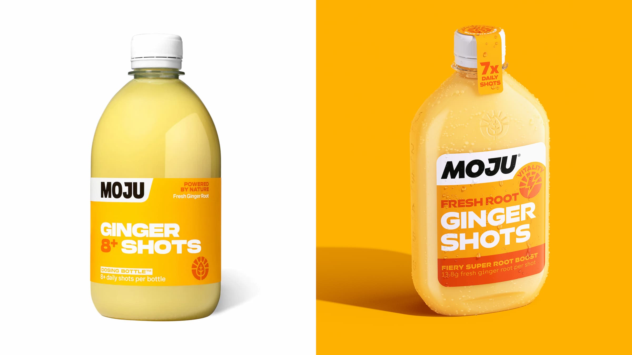
Today on Brand New: New Logo, Identity, and Packaging for MOJU by Earthling Studio.
Anyone over about 25 would likely feel that of all people, big-time YouTubers aren’t exactly in need of a coffee fix: high-octane, breathless excitement and endless, pause free chitchat don’t exactly scream ‘3pm slump’.

Earthling Studio updates UK’s fastest growing soft drinks brand, MOJU, with a new brand identity, iconic new bottle design and improved range navigation all delivering a powerful hit of fresh nutrition.
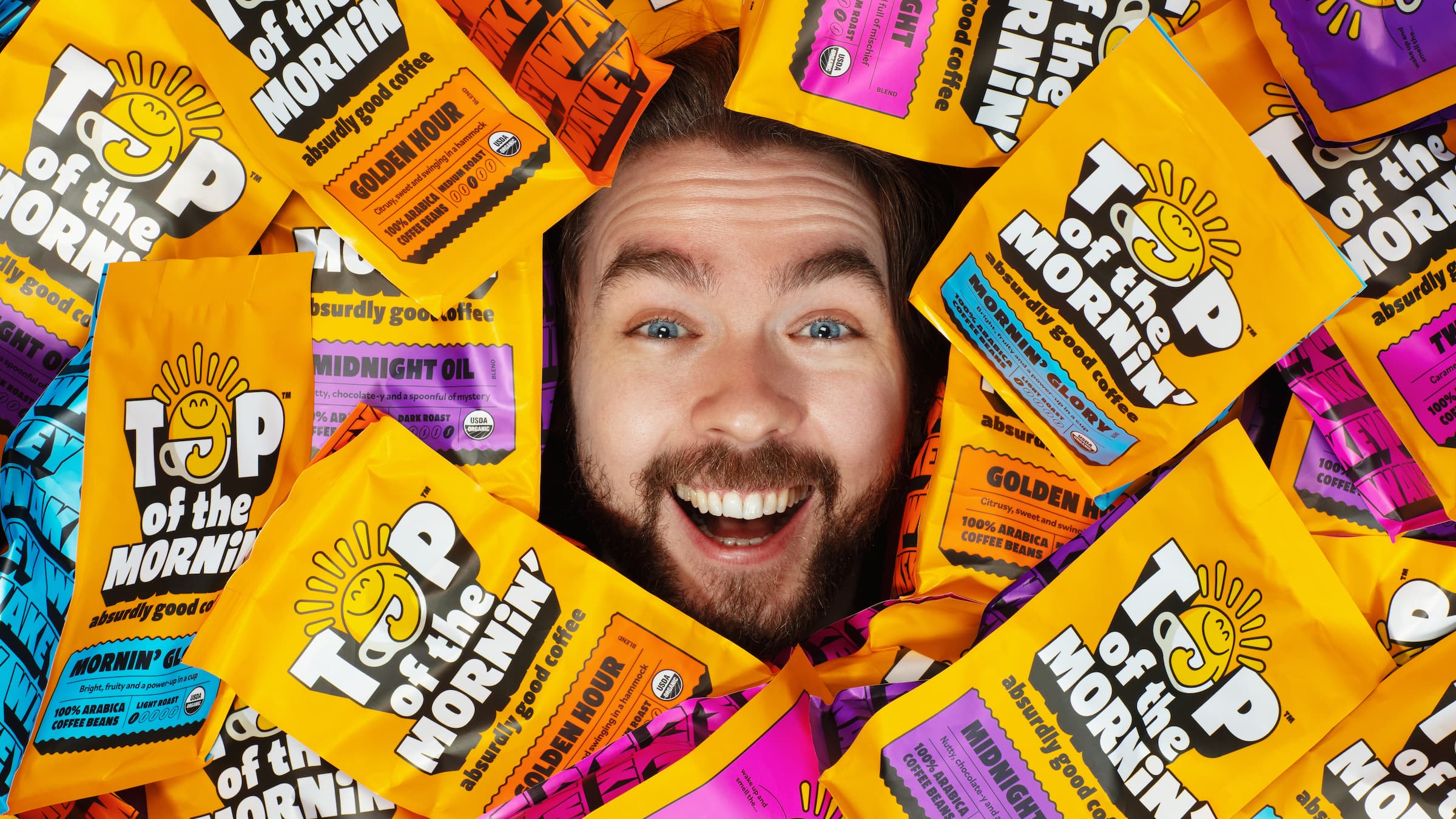
Today on Brand New: New Logo, Identity, and Packaging for Top of the Mornin’ Coffee by Earthling Studio.
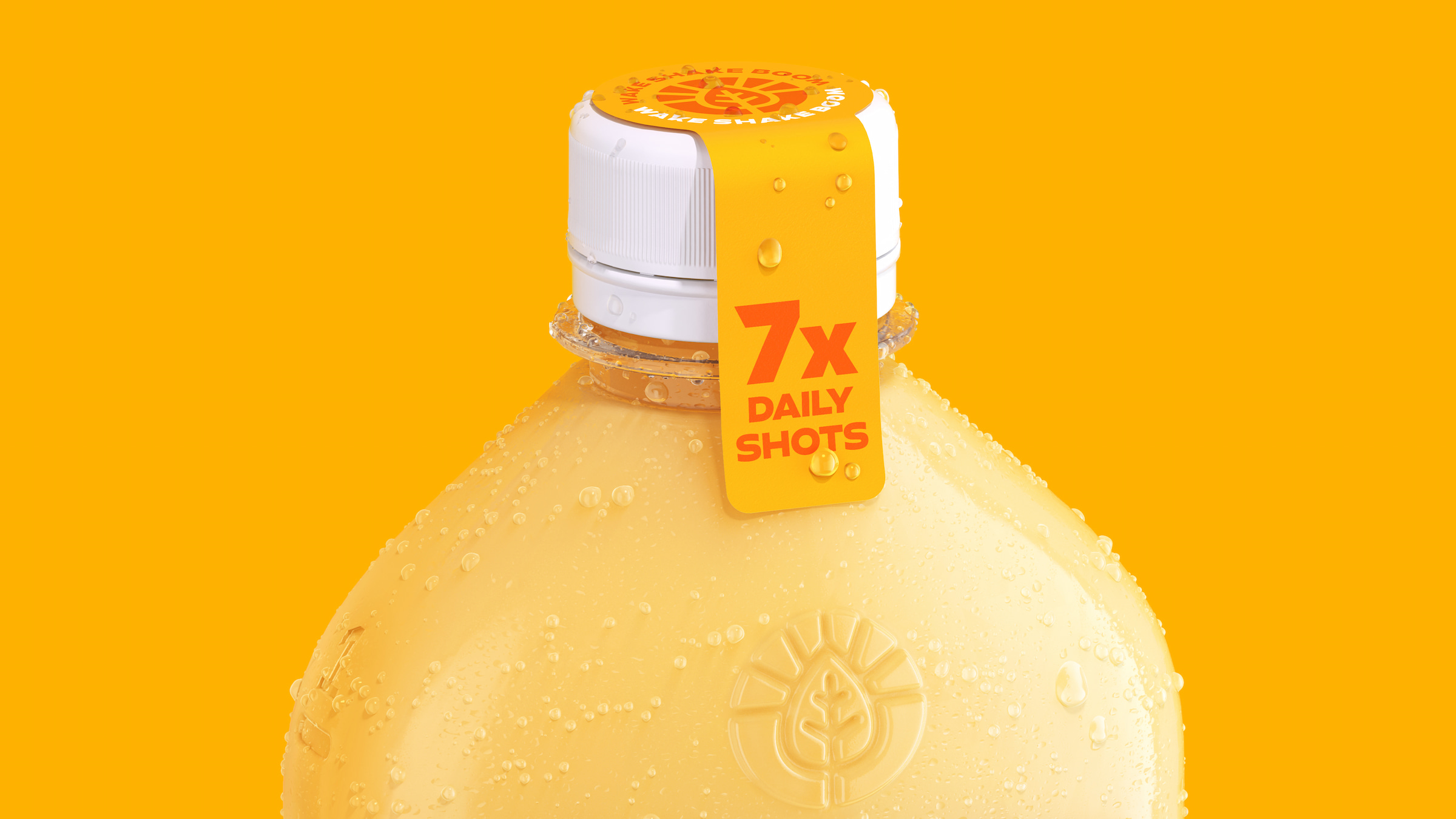
Shake Shot Up with Earthling Studio’s Packaging System for MOJU.
Episode 069: Top of the Morning Coffee, a conversation with Stephen McDavid, Earthling Studio and Hugh Thomas, Top of the Morning’ Coffee.

Earthling Studio delivers an unapologetic, vibrant and bold visual redesign for MOJU.